Sheffield Hallam showcased their student’s work around many campuses throughout Sheffield. I felt that some exhibitions were associated quite far away from others, which made it difficult to find. The types of courses exhibited were Graphic Design, Product Design, Architecture, Furniture Design, Photography, and Animation. Although the exhibitions were situated in scattered areas I felt that it was well directed and easy to find. I felt that all the displays were produced to a highly professional standard and each display had a business card for contact, the standard of work was also very high which impressed me a lot.
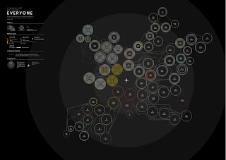
I felt the graphic design exhibition had a lot of creative pieces of work and students had produced different briefs with many different outcomes. One piece of design that I felt was very unique and had a lot of meaning to, was Ben Powell’s graduation piece. He said it was a visualization of the emotional effect that people have had on him in his life and how they connect to each other. The overall image is quite intriguing as there a lot of different colours and the shape is interesting. Once you look into how it works it also becomes very clever how he has mapped out each relationship and given them a colour to how they have made him feel. I think it’s a nice way of seeing your relationships as an overall image and I would happily try to create something similar.
I came across Kirsty Wilkinson seems to have a wide range of styles and she appears to apply both digital and traditional mixed media work. My favourite part of her work is her mixed media work, which were observational drawings of people around Sheffield. She’s applied newspaper, train tickets and any paper to the image to add a nice texture. Her digital work is produced in a different style with more clean concise lines and an example of this is her film posters she’s creating for her graduation project. Her film poster for Taxi Driver was screen-printed and she used two guns and a line above it to create the outline of the empire state building because Taxi Driver is in New York. When I first saw the film poster I knew that it was designed to have another meaning to it and once I looked on her website I saw why she had created it like that. What I also like about this image is the simplicity and how the bold black lines stand out from the simple yellow background.


No comments:
Post a Comment